DIGIPAK

This is the final version of my digipak. I believe have successfully captured the nature of our artist through her signature colour, purple, and have also made it eye-catching enough for it to compete with other digipaks on the shelves. As stated before, electro-pop albums and digipaks do not have any clear conventions, so I had complete artistic freedom when making this - as it is her debut album, I decided it would be wise if it had some visual link to the music video and God's Own Junkyard was the ideal spot for the images to be taken. There isn't much emphasis on the artist herself, this was intentional, as we never put much focus on her looks/image.
POSTER
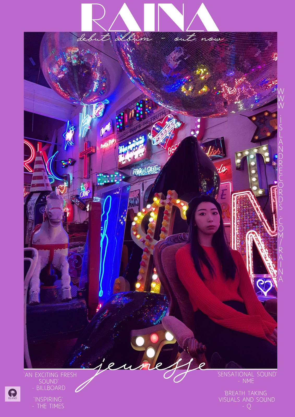
The poster fits goes hand-in-hand with the digipak, it uses the same main image for ease of finding and I have created a house style between the ancillary texts and music video. It is simple, but promotes the information needed for the release of the digipak and music video. The reviews are from well know music companies, and since the first draft I have changed some of the fonts so they're easier to read. The purple border works well on the poster, as the main image is busy and the text would have gotten lose amongst the image.


No comments:
Post a Comment