Wednesday, 9 May 2018
Evaluation: How did you use media technologies in the construction and research, planning and evaluating stages?
How did you use media technologies in the construction and research, planning and evaluating stages?
Niamh's part was cut out right at the end therefore we have to type up her part.
"Premiere Pro proved to be one of the most important software's involved within the creative process as the whole construction of the video came down to editing. This was more so the case for this video as it relied a lot upon the editing due to the shots on their own only becoming relevant when edited together with the effects to create this ground hog day narrative result. Therefore, the editing was the process that made them work within the video and link into this story that we were telling throughout. In addition to this, the editing helped to make the video conventional of the genre with the effects applied within, and the fast pace editing as the most artistic aspect was the coloured filter, stamp text and the overlays. Without the use of Premiere Pro and the access to tutorial videos, the assembly of the footage would be less interesting and sophisticated."

Evaluation: In what ways does your media product use, develop or challenge forms and conventions of real media products?
In what ways does your media product use, develop or challenge forms and conventions of real media products?
Monday, 7 May 2018
Evaluation: How effective is the combination of your main product and ancillary texts?
How effective is the combination of your main product and ancillary texts?
I believe my combination of the music video and ancillary texts are effective. Our music video falls into the electro-pop sub-genre with the ancillary texts following a similar artistic style - they complement one another with clear house style between the two.
The music video follows the conventions of electro-pop as the artist is seen wearing dark casual clothing, there is an emphasis on location and she does not follow the social norm. The latter is conventional for the sub-genre as it allows more creative and artistic freedom more so than the other genres, and we have achieved this through the performance, cinematography and editing. We challenge some of Goodwin’s theories for what makes a good music video, as we do not sexualise the artist nor focus on close ups and the notion of looking - this was intentional, as we wanted to make the artist different from the rest and stand out in her own way. These are some of the reasons why our music video was effective, as it has its own appeal to the audience, which is the one we are targeting.
After looking at a variety of digipaks and albums for electro-pop artists we realised there wasn’t a convention for them, they were all different and represented the artist in their own stand-alone way. From this we took inspiration, and asked what represented our artist? We had the trademark of her beret, which links to her family origins, as well as the emphasis placed on the nightlife and neon lights. Therefore the location God’s Own Junkyard became the ideal spot for our ancillary text images, they were success and so were used. They have the visual link to the music video itself, which is effective for marketing considering the music video is her debut - meaning fans know what to look for when buying the album.
The two work well together due to the previously stated reasons and are effective because of this, they challenge and conform to conventions, but also have an unique and fresh look which hasn’t been seen before. Both the music video and ancillary texts appeal to the target audience, which makes them effective, due to the amount of audience feedback we have received - the fact our group is the prime age for Raina’s fan helped us understand what they could want.
Sunday, 6 May 2018
Friday, 4 May 2018
Digipak and Poster
DIGIPAK

This is the final version of my digipak. I believe have successfully captured the nature of our artist through her signature colour, purple, and have also made it eye-catching enough for it to compete with other digipaks on the shelves. As stated before, electro-pop albums and digipaks do not have any clear conventions, so I had complete artistic freedom when making this - as it is her debut album, I decided it would be wise if it had some visual link to the music video and God's Own Junkyard was the ideal spot for the images to be taken. There isn't much emphasis on the artist herself, this was intentional, as we never put much focus on her looks/image.
POSTER


This is the final version of my digipak. I believe have successfully captured the nature of our artist through her signature colour, purple, and have also made it eye-catching enough for it to compete with other digipaks on the shelves. As stated before, electro-pop albums and digipaks do not have any clear conventions, so I had complete artistic freedom when making this - as it is her debut album, I decided it would be wise if it had some visual link to the music video and God's Own Junkyard was the ideal spot for the images to be taken. There isn't much emphasis on the artist herself, this was intentional, as we never put much focus on her looks/image.
POSTER
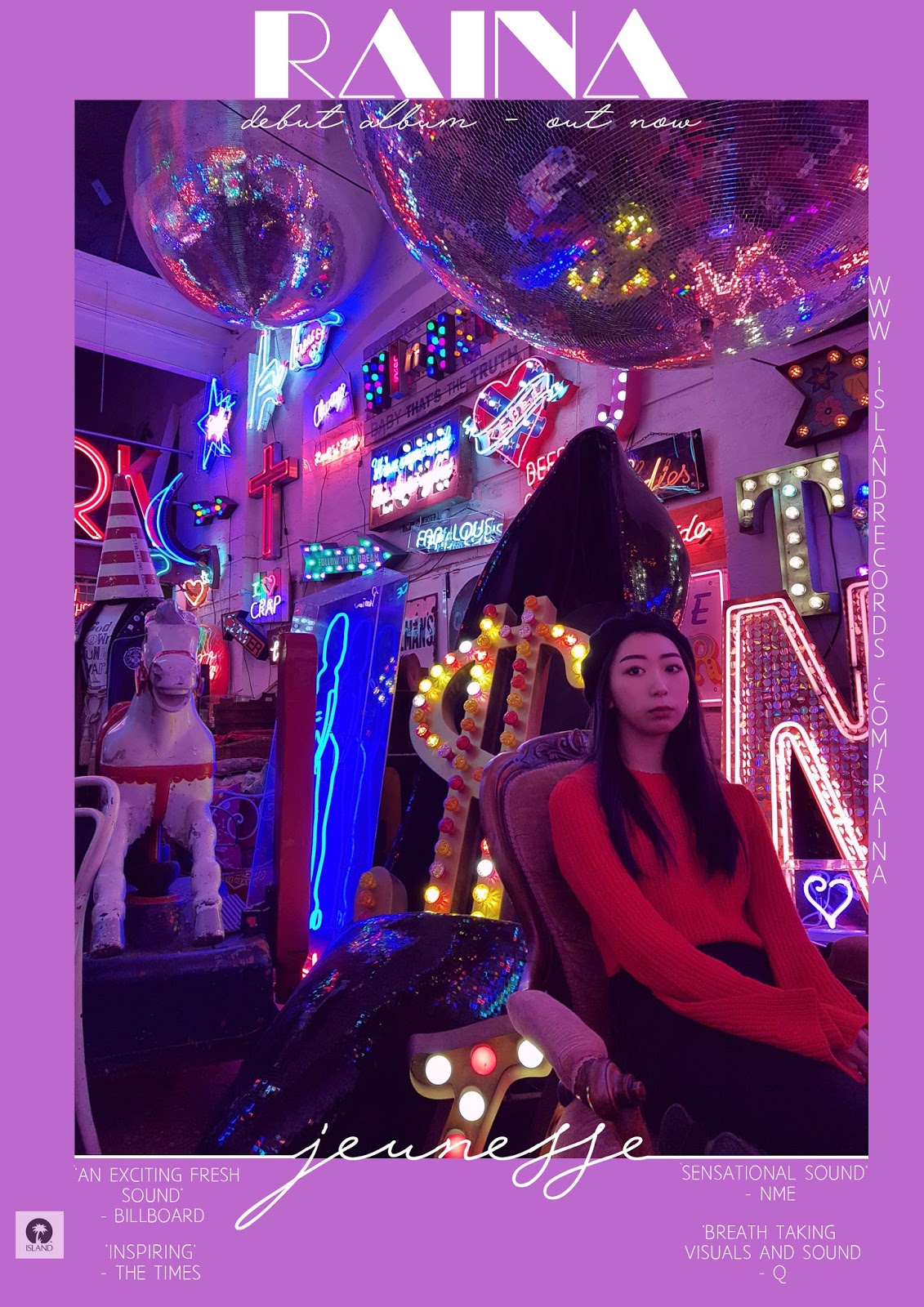
The poster fits goes hand-in-hand with the digipak, it uses the same main image for ease of finding and I have created a house style between the ancillary texts and music video. It is simple, but promotes the information needed for the release of the digipak and music video. The reviews are from well know music companies, and since the first draft I have changed some of the fonts so they're easier to read. The purple border works well on the poster, as the main image is busy and the text would have gotten lose amongst the image.
Music Video
This is the final cut of the music video, we have made the necessary changes and took our audience feedback on board. The video has improved majorly since the first draft, we have filled the gaps and have established the Ground Hog narrative successfully. The music video follows the conventions of electro-pop and also some of Goodwin's, we do not strictly follow his theory however, as it would have limited our creative freedom that electro-pop thrives off.
Sunday, 15 April 2018
Digipak and Poster Progress

Poster process, some of the writing is hard to read so I will change that. However the purple border works well as it allows the writing to be read easier, also allowing the image itself to not be interrupted by text. It gets the message across clearly and simply. Another thing that needs to be worked on is the logo of the music company, as it looks awkwardly placed. The artist's name is placed at the top, and it stands out due to the contrast and is eye-catching. I have also established a house style through the digipak and poster, this is through the use of the borders and purple hue.

This is the whole digipak so far, I still need to work on the sides, add another CD and the details on the back of the digipak - such as a bar code. Overall, however the digipak is coming along well and I'm achieving the style I had in mind.

This is the finished front cover. It's simple and the neon title links with the location, genre and the artist herself. This image works better than the previous due to there being less red, and the amount of negative space pushed the viewer to focus on the visuals as well as the artist. This is intentional, as it's a convention of the elctro-pop genre.
Saturday, 14 April 2018
Tracklist
 |
| 1- Desperate Youth (MV) 2- Run 3- Honey 4- Dusk 5- Forever Young 6- Purple Haze 7- Rain 8- One Night in Paris 9- Automatic 10- You Don't Know
This is the tracklist for my digipak, it's simple and to the point yet still has an artistic feel to it. I still need to add the barcode, copyright text and Island Record's label to the back - however, I believe the design itself suits the rest of the album so far and it allows the viewer to focus on the front as it is not distracting.
|
Friday, 13 April 2018
Initial CD design

This is the first attempt for my CD, I like the abstract feel I have created through the white lines and gradient, with Raina blending in with the gradient. Although this works well and suits the album, the CD and gradient is too light in comparison to the rest of the panels. To fix and improve I will change the colours so it matched the rest of the album.
Tuesday, 10 April 2018
Digipak Draft(s)
Initial attempt (front panel):


The idea that has stuck out to me the most is the joint up writing for the title of the album, Jeunesse. This is because it gives off a chic vibe. However, the colouring for the texts and actual photo do not fit. It's hard to create the purple hue I want due to the amount of red in the photo, and purple text contrasts with the red. Therefore i will pick a different image and see if that works instead.
To create the slight blur effect, I duplicated the main image, reduced the transparency of the duplicate, and moved it slightly to the left. This worked well, as the eye contact from the artist makes the image seem hypnotic and more eye catching.
Monday, 2 April 2018
Idea for the Digipak and Album Artwork
Albums in this genre do not have conventions and are experimental in comparison to other genres, because of this I will have complete freedom when making my digipak - however, I have looked at other albums from artists such as Kehlani and Charlie CXC to gather inspiration and ideas.
I want my digipak to be chic and simplistic in terms of editing and effects as the images we have captured are busy - with lots of neon lights in the background. Therefore I do not want my digipak to be overpowering.
Similar to the music video it will have a purple hue/theme that represents nightlife and the electro-pop genre. Other albums in the genre are also quite artistic whether that's shown through the photography or editing, therefore I can have a fair amount of artistic freedom when it comes to creating the digipak. I will mess around with a few ideas to see what works.
Thursday, 22 March 2018
White-screen shoot
Today we filmed a hand-full of lip syncing shots for the music video - most notably the "Ooh-ahs" since they were the most out of sync compared to the actual song and music video. We also captured some of the lip syncing shots we'd initially got at God'd Own Junkyard, since some lyrics were repeated and it was not practical to re-shoot these shots at the location. The shoot was quick and successful, with the majority of the footage being used in the final cut of the music video.
Thursday, 15 March 2018
Arcade reshoot
Today we met as a group to reshoot our arcade scenes and capture a handful of location ones, as we had a space to fill in our music video. We decided to film on our phones instead of the DSLRs, as the HDR on our phones was being for shooting in the dim lit location. The shoot was successful because we managed to capture what we intended to and all the footage was in focus - with a fair amount of the footage being good enough to use for the actual music video.
Sunday, 11 March 2018
First Draft Feedback
After showing the class our first draft we received feedback, they pointed out things that needed to be improved and worked upon - such as lip syncing and reused footage. Although our group already knew this and intended to fix them, the feedback was useful as it also showed what worked well. For example, the complimented Kelly's (Raina) overall performance and the cinematography. We also received some pointers about editing which will be useful as they apply to the conventions of our music video and the electro-pop genre.
For a first draft it was relatively successful and with the necessary changes we will be able to achieve our desired result, as a group we will plan when to re-shoot due to our differing schedules.
Saturday, 10 March 2018
First Draft
This is the first draft of our music video, clearly there is still a lot of work to be done as we did not realise we had so little footage while filming. We will re-visit some locations to capture more shots, as well as re-shooting some of the lip-syncing as it is out of time. The video also feels quite repetitive and boring, meaning we haven't established our Ground Hog narrative clear enough - however this can be achieved through editing.
Reshoot Plan
After viewing our first draft and being given feedback we met as a group and decided what we needed to do next. We agreed we needed to reshoot the arcade scenes as they were too dark on the DSLRs, and some lip syncing shoots in front of the white screen. This is because they allowed more editing and travelling to our previous locations was not efficient, due to differing seasons and the time we had left to complete the music video. Our reshoots will take place as soon as possible to allow more time for editing, as to fit the genre more we will be heavily editing the music video.
Wednesday, 7 February 2018
Blog Feeback

To improve my blog further i will consider using a variety of formats in my blog, such as power points and films of us talking about the working we're making. I will also post the current drafts of my digipak, paired with an explanation of my ideas.
Friday, 26 January 2018
Digipak Shoot


These are the most successful shots from our digipak shoot, as the lighting fits the genre and our artist's body language is carefree and relaxed, which was our intention. I will test all of the images and decide which one works best with the idea i have.
The location shots were also successful, and i will use these two for the digipak.


The location shots were also successful, and i will use these two for the digipak.


Monday, 22 January 2018
Filming - 22/01/18
Today we done our initial arcade shoot, as well as the sequence for the beginning of the music video which we filmed in the car park underneath the arcade. We used both a DSLR and our phones to capture the footage, focusing both on the locations and the artist. Here, a lot of the shots matched up with the lyrics, which links to Goodwin's theory. An example of this would be seen where the artist is playing a shooter game, as the lyrics say "fight for our lives." One issue we found with the footage, however, was that some of the shots were too dark due to the arcade's lighting. To fix this in a re-shoot we will shoot from a different angle, in attempt to bait the lighting to where we want it.
Saturday, 20 January 2018
Filming - 20/01/18
Today we visited God's Own Junkyard, located in East London, to film for our music video. However, we were not permitted to use the DSLR so we filmed and took photos for the digipak using our phone. The footage was relatively successful, as we managed to film Kelly lip syncing some of the lyrics to the song as well as more visual shots. The visual shots were more successful, as they fit the genre of the music video (electro-pop) perfectly, these shots will be used through out the music video as it is more focused on the locations/visuals rather than Raina.


The images for our digipak were the most successful as we managed to capture a variety of shots that focus on our artist as well as the visuals of the location. Some will be used for the digipak, as they are visually striking and well framed, meaning they will not need much, if any, post-production work. This was intentional, as we do not want our digipak to be over edited.
Subscribe to:
Posts (Atom)
Evaluation: How did you use media technologies in the construction and research, planning and evaluating stages?
How did you use media technologies in the construction and research, planning and evaluating stages? Niamh's part was cut out righ...

-
 As a group we analysed the lyrics to our music video, deciding to use a mixture of shots that will focus on the location and the art...
 -
How effective is the combination of your main product and ancillary texts? I believe my combination of the music video and ancillary ...
-
How did you use media technologies in the construction and research, planning and evaluating stages? Niamh's part was cut out righ...
